How a Misplaced HTML Button Broke Our CSS Layout
Recently, I ran into an annoying layout bug in the trip dashboard of BeenThere - a minimal travel storytelling platform we are building where users can document their journeys and claim their own personal travel page.
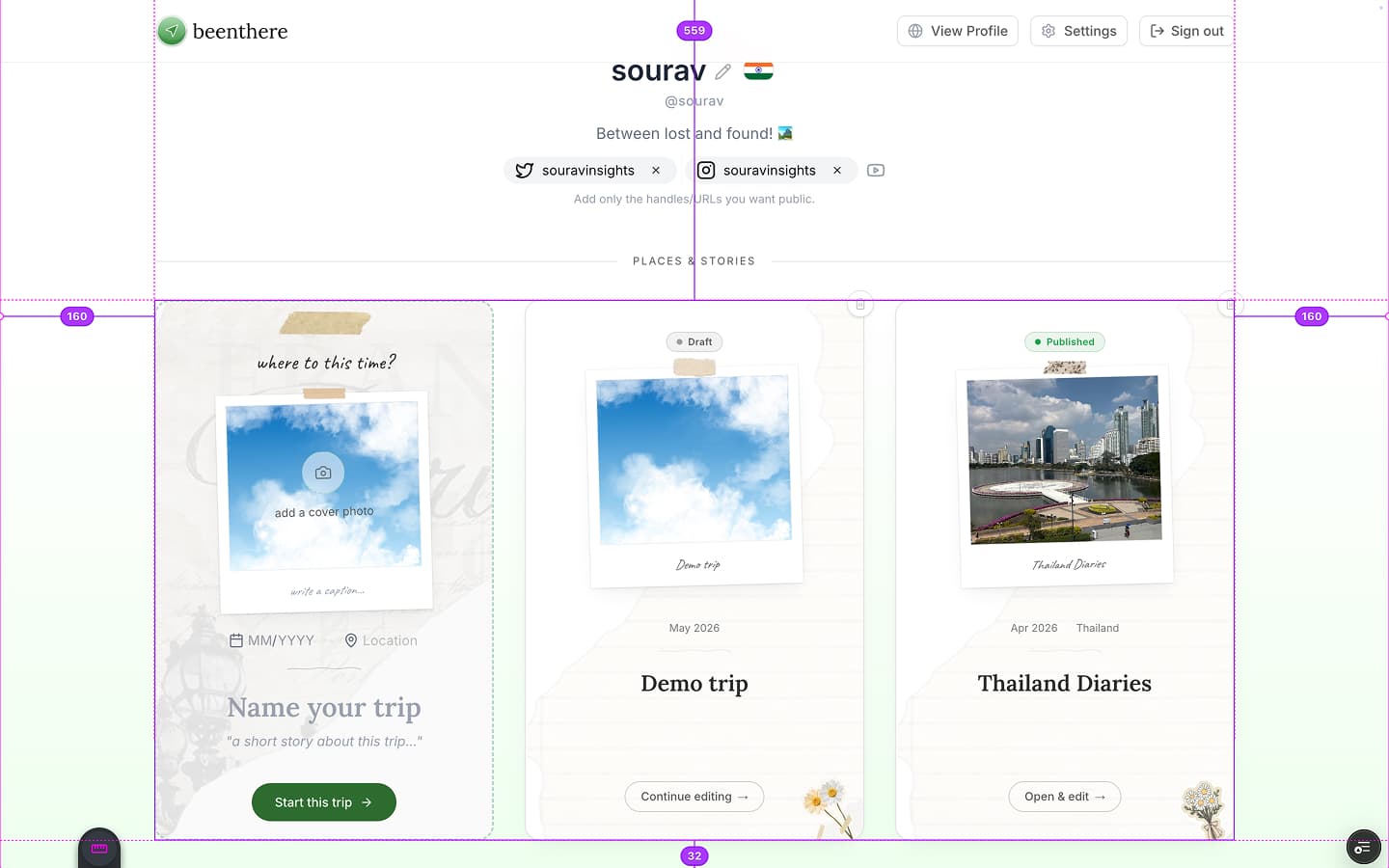
The layout shift bug was in the /me page where users view their grid of saved trips. When you refreshed the page, the loading skeletons for these trip cards would stretch all the way to the edges of the screen, completely breaking out of their container. A second later, when the React app finished loading, everything would suddenly snap back into the center where it belonged. It was a very noticeable and jarring layout shift.
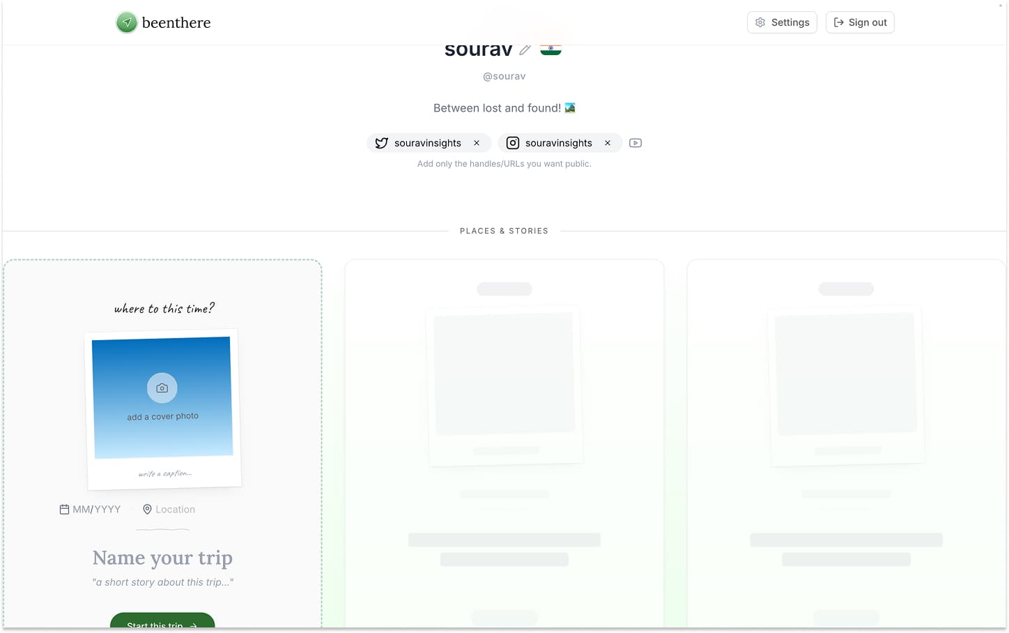
Notice how the loading skeletons break out of the central column and stretch 100% of the screen width.
At first, I was sure it was a CSS issue. I tried adding max-width: 1024px directly to the grid container, I tried wrapping the grid in overflow-hidden, and I tried forcing strict pixel widths on the skeleton cards themselves. Nothing worked. The grid just refused to stay inside its container during the loading phase.
Instead of guessing more CSS classes, I decided to look at the raw HTML the server was sending to the browser, right before React loads and takes over the page.
Here is how we tracked down the real issue.
Freezing the Loading State
Because the loading state flashes by in a fraction of a second, I couldn't easily inspect the elements in Chrome DevTools.
To fix this, I opened the Network tab in DevTools and set the throttling to Slow 3G. This forced the loading skeletons to stay on the screen long enough for me to inspect them.
I copied the raw HTML of the page while it was loading. Then, I turned off throttling, let the page load completely, and copied the fully loaded HTML. I now had two snapshots to compare.
Comparing the HTML Structure
When I compared the two HTML files, I noticed a massive structural difference.
In our React code, the grid of trip cards sits inside a central layout container that keeps everything constrained and centered. It looks roughly like this:
<div class="max-w-6xl mx-auto"> <!-- This centers the content and limits width -->
  <div class="profile-header">...</div>

  <div class="trip-card-grid">...</div> <!-- The grid is safely inside -->
</div>
But in the raw HTML during the loading state, the structure looked like this:
<div class="max-w-6xl mx-auto">
  <div class="profile-header">...</div>
</div> <!-- The centered container closes early! -->

<!-- The grid is now outside the centered container! -->
<div class="trip-card-grid">...</div> React expects the Trip Grid to live safely nested inside the Main Container.
Because the max-w-6xl container closed early, the grid fell outside of it. Without that CSS constraint, the grid naturally expanded to 100% of the screen width. That explained why the cards were stretching to the edges.
But why was the container closing early?
Finding the Root Cause
To figure this out, I used an AI assistant to write a quick Node.js script to analyze the HTML. The script's job was simple: read through the file and match every opening <div> with its corresponding closing </div>. If a <div> closed earlier than expected, the script would flag it.
The script pointed out the exact spot where the HTML structure broke. It was inside a small UI component in the profile header: a Country Flag Picker.
Here is what the React code for that component looked like:
<button className="flag-picker-trigger">
  <div className="relative">
    <FlagImage />

    {/* A button to clear the selected flag */}
    <button className="clear-selection">X</button>
  </div>
</button>
The problem was right there: we put a <button> inside another <button>.
How the Browser Reacts to Bad HTML
According to HTML rules, you cannot nest interactive elements. A button cannot contain another button.
When the browser receives this HTML from the server, its internal parser spots the mistake. To try and fix it, the browser automatically closes the first button before starting the second one.
But to close the outer button, it also has to close the <div> inside it. This causes a chain reaction. The browser starts auto-closing tags to make the HTML valid, which throws off the alignment of all the closing </div> tags that follow.
By the time the browser reaches the end of the profile header, it thinks it's supposed to close the main max-w-6xl container, entirely by mistake.
Later, when React finishes loading (hydration), it forces the DOM to match the original React code, pulling the grid back inside the container and causing the sudden layout shift.
Browsers don't allow a button inside a button. It auto-closes the tags to try and fix it, causing our main container to close way too early.
return ( <div className="max-w-4xl mx-auto"> {/* Flag Picker */}<button className="trigger"> <FlagIcon /> <button>Clear</button> </button>{/* Trip Cards Grid */} <TripCardsGrid /> </div> );
The Fix
The fix was incredibly simple. I changed the outer <button> into a <div> and gave it a role="button" so it remained accessible to screen readers and keyboards.
<div role="button" tabIndex={0} className="flag-picker-trigger">
  <div className="relative">
    <FlagImage />
    <button className="clear-selection">X</button>
  </div>
</div>
Since a <div> is allowed to contain a <button>, the browser stopped trying to auto-correct our HTML. The main container stayed open, and the layout shift completely disappeared.
Takeaways
- Stop guessing with CSS. If a layout is breaking unexpectedly during initial load, inspect the raw HTML structure first. I could have saved hours by doing this earlier.
- HTML semantics matter for layout. Small semantic errors, like putting a button inside a button, can cause the browser to automatically rewrite your DOM, which can break your CSS layout in unpredictable ways.
The final fixed layout! No layout shift in the skeletons during loading anymore, and they now stay perfectly inside the max-w-6xl container.